จากการรวบรวมแนวคิดของผู้ร่วมก่อตั้งทั้ง 3 ท่านโลโก้ใหม่ของ Intersex Thailand สะท้อนความหมายอันลึกซึ้งผ่านองค์ประกอบต่างๆ ดังนี้:
สีและรูปทรง:
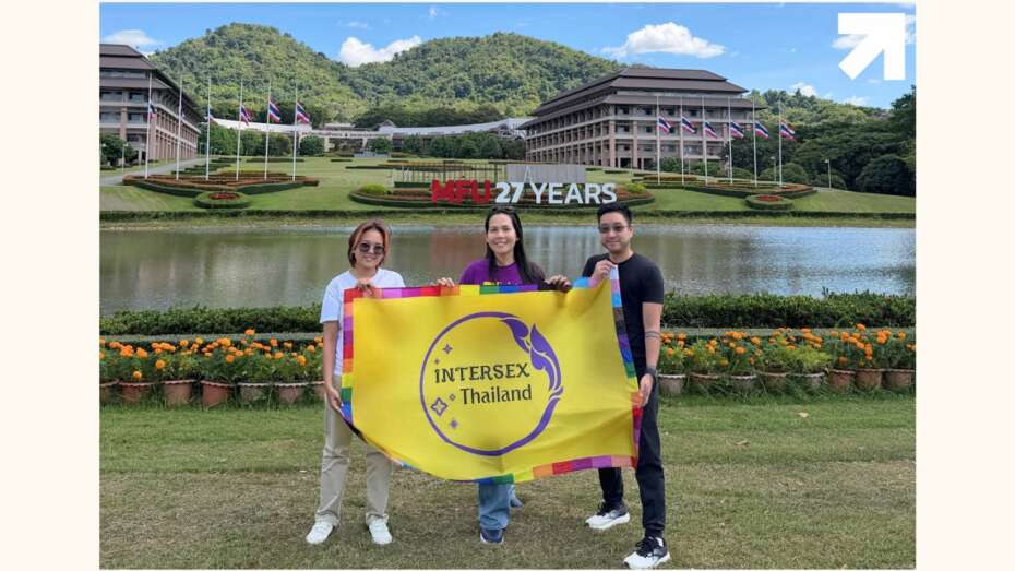
วงกลมสีม่วง สื่อถึงการผสานระหว่างความเป็นชายและหญิง โดยสีม่วงเกิดจากการผสมผสานระหว่างสีฟ้าและชมพู
พื้นสีเหลือง เป็นสีตรงข้ามกับสีม่วง สื่อถึงอัตลักษณ์ที่นอกเหนือจากความเป็นชายและหญิง
วงกลมที่สมบูรณ์ แสดงถึงความสมบูรณ์ในตัวตนของบุคคลอินเตอร์เซ็กส์ โดยไม่จำเป็นต้องถูกแก้ไขหรือดัดแปลง
ลวดลายไทยประยุกต์:
ลายกนกไทยที่ได้รับการตัดทอนให้เรียบง่าย ผสมผสานความเป็นไทยเข้ากับความร่วมสมัย
เส้นสายที่ไหลลื่น ไม่มีปลายแหลม สื่อถึงความอ่อนโยน การเติบโตงอกงาม และการเชื่อมร้อยชุมชนเข้าด้วยกัน
ดอกพิกุลที่มีขนาดแตกต่างกัน สะท้อนถึงความงดงามและความหลากหลายตามธรรมชาติของบุคคลอินเตอร์เซ็กส์ในประเทศไทย ที่ควรได้รับการมองเห็นและยอมรับในทุกช่วงวัย
การใช้งาน:
ออกแบบให้เรียบง่าย ชัดเจน มองเห็นได้ในระยะไกล
เหมาะสมสำหรับการใช้งานหลากหลายรูปแบบ ทั้งงานพิมพ์ งานปัก และสื่อดิจิทัล
ยังคงความโดดเด่นแม้อยู่ร่วมกับโลโก้องค์กรอื่น
สามารถใช้ได้ทั้งในรูปแบบสีและขาวดำโดยไม่สูญเสียความชัดเจน
โลโก้นี้ไม่เพียงสื่อถึงอัตลักษณ์ขององค์กรเท่านั้น แต่ยังสะท้อนถึงวิสัยทัศน์ในการสร้างพื้นที่ที่ปลอดภัยและเป็นกำลังใจให้กับชุมชนอินเตอร์เซ็กส์ในประเทศไทยการเลือกใช้ดอกพิกุลในขนาดที่แตกต่างกันยังเน้นย้ำถึงความสำคัญของการยอมรับและเห็นคุณค่าของความหลากหลายในทุกช่วงวัยของชีวิต
สำหรับทัศนะของผู้ออกแบบคุณ กฤศ ธรรมสโรช (Kris Dharmasaroja) รูปแบบเส้นที่มีลักษณะไม่เท่ากัน ให้ความรู้สึกไม่เเข็งกระด้าง แสดงถึงความเคลื่อนไหว ความปราดเปรียว ความคล่องตัว และรู้สึกราบรื่น ลักษณะของลวดลาย เป็นรูปแบบลายกนก ที่ตัดทอนจากลายต้นฉบับแบบไทย ทำให้รู้สึกถึงความเป็นไทยในรูปแบบสากลมากขึ้น ทำให้เรียบง่าย สะดุดตา เหมาะกับยุคสมัย และเข้าถึงง่าย

New Year, New Logo for Intersex Thailand
The new logo of Intersex Thailand reflects profound meanings through various elements:
Colors and Forms:
The purple circle represents the fusion of masculine and feminine qualities, with purple being a blend of blue and pink
The yellow background, being complementary to purple, represents identities beyond the male-female binary
The complete circle symbolizes the wholeness of intersex individuals, emphasizing that no medical intervention or modification is necessary
Thai-Inspired Design Elements:
The simplified Thai Kanok pattern combines traditional Thai aesthetics with contemporary design
Flowing, smooth lines without sharp ends convey gentleness, growth, and community interconnectedness
Different-sized Pikul flowers reflect the natural beauty and diversity of intersex individuals in Thailand, emphasizing visibility and acceptance across all age groups
Practical Applications:
Designed for simplicity and clarity, visible from a distance
Versatile for various applications including print, embroidery, and digital media
Maintains distinctiveness when displayed alongside other organizational logos
Effective in both color and black-and-white formats
This logo not only represents the organization’s identity but also reflects its vision of creating a safe and supportive space for the intersex community in Thailand. The use of varying sizes of Pikul flowers emphasizes the importance of recognizing and valuing diversity across all life stages.
From the designer’s perspective, Kris Dharmasaroja explains that the uneven line characteristics create a sense of fluidity rather than rigidity, expressing movement, agility, and smoothness. The pattern, adapted from traditional Thai Kanok designs, has been simplified to achieve a more internationally accessible yet distinctly Thai aesthetic, making it simple, eye-catching, contemporary, and approachable.